/ About
Extending a Brand Identity, Not Replacing It
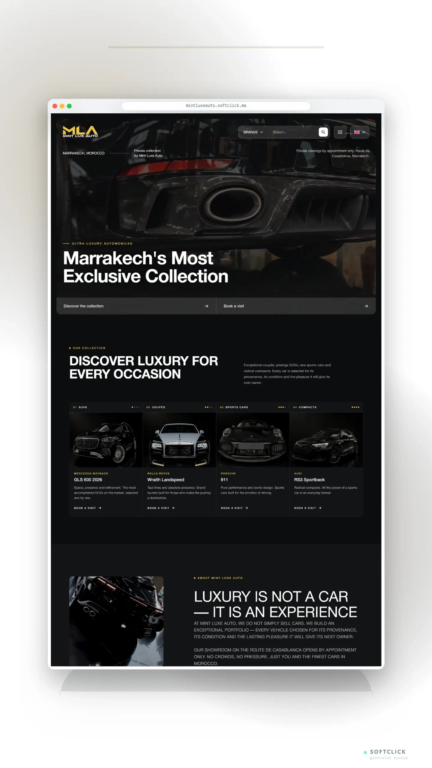
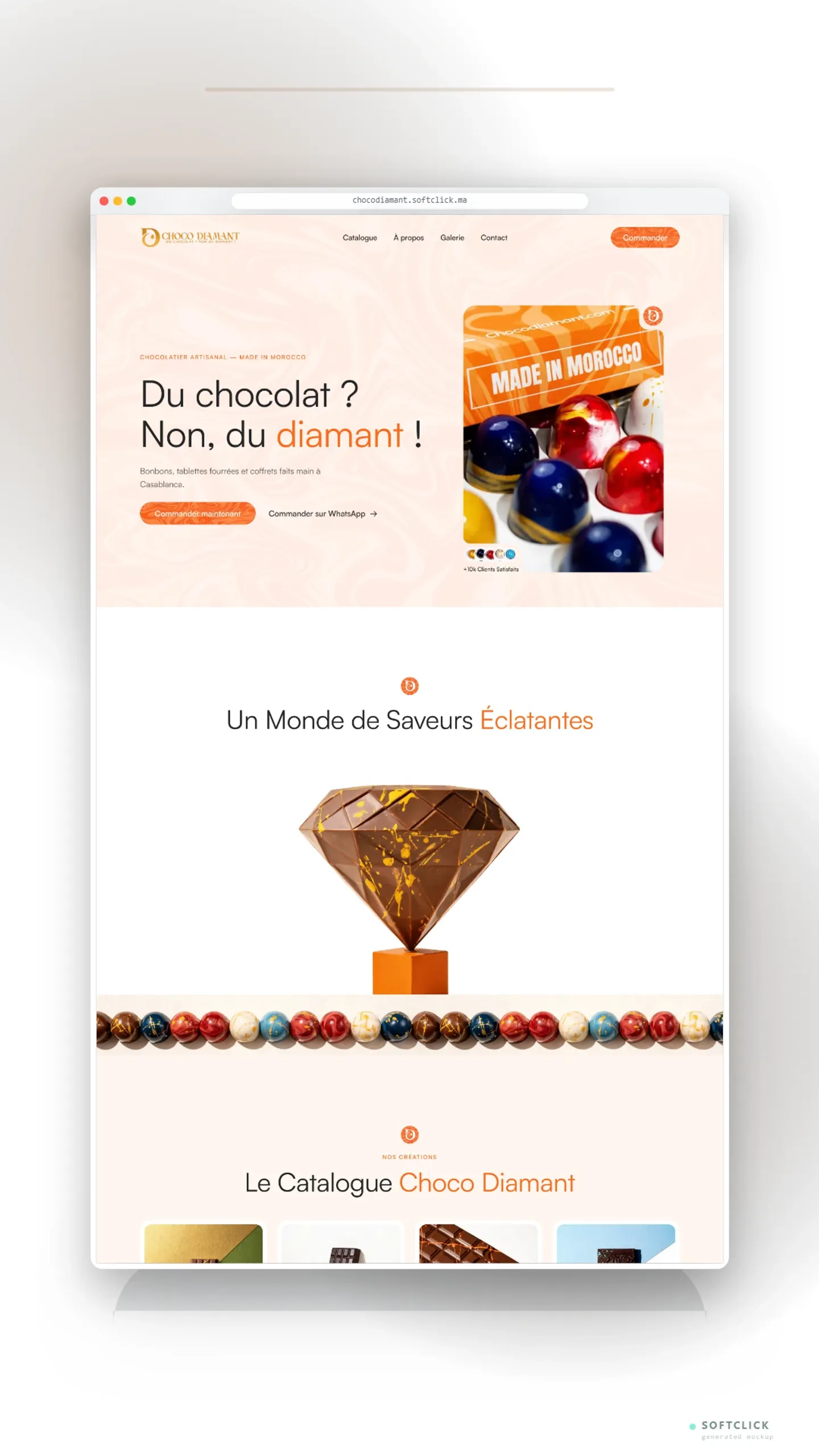
Choco Diamant already had a strong visual language: its signature orange marble, colorful dome bonbons and bicolor diagonal backgrounds shot in hard natural light. Rather than impose a new aesthetic, we built a complete design system derived from the brand's primary orange and extended its photographic universe through AI-generated assets — every image anchored to real product references so nothing was deformed or invented. The result feels unmistakably Choco Diamant, only sharper, richer and ready for the web.
A Living, Sculptural Experience
The site brings the chocolate to life through motion rather than effects: a slowly flowing marble video under a white veil, sculptural product objects that rise and turn as you scroll, a seamless infinite gallery, marble-textured buttons and a full-bleed atelier film of molten chocolate. Glass header, corner-notched hero card and a marble emblem above every section give the experience a precise, editorial rhythm — pop-premium energy with Moroccan pride at its heart, from the carved caftan tablet to the Berber jewel bar.
Built for Performance and Conversion
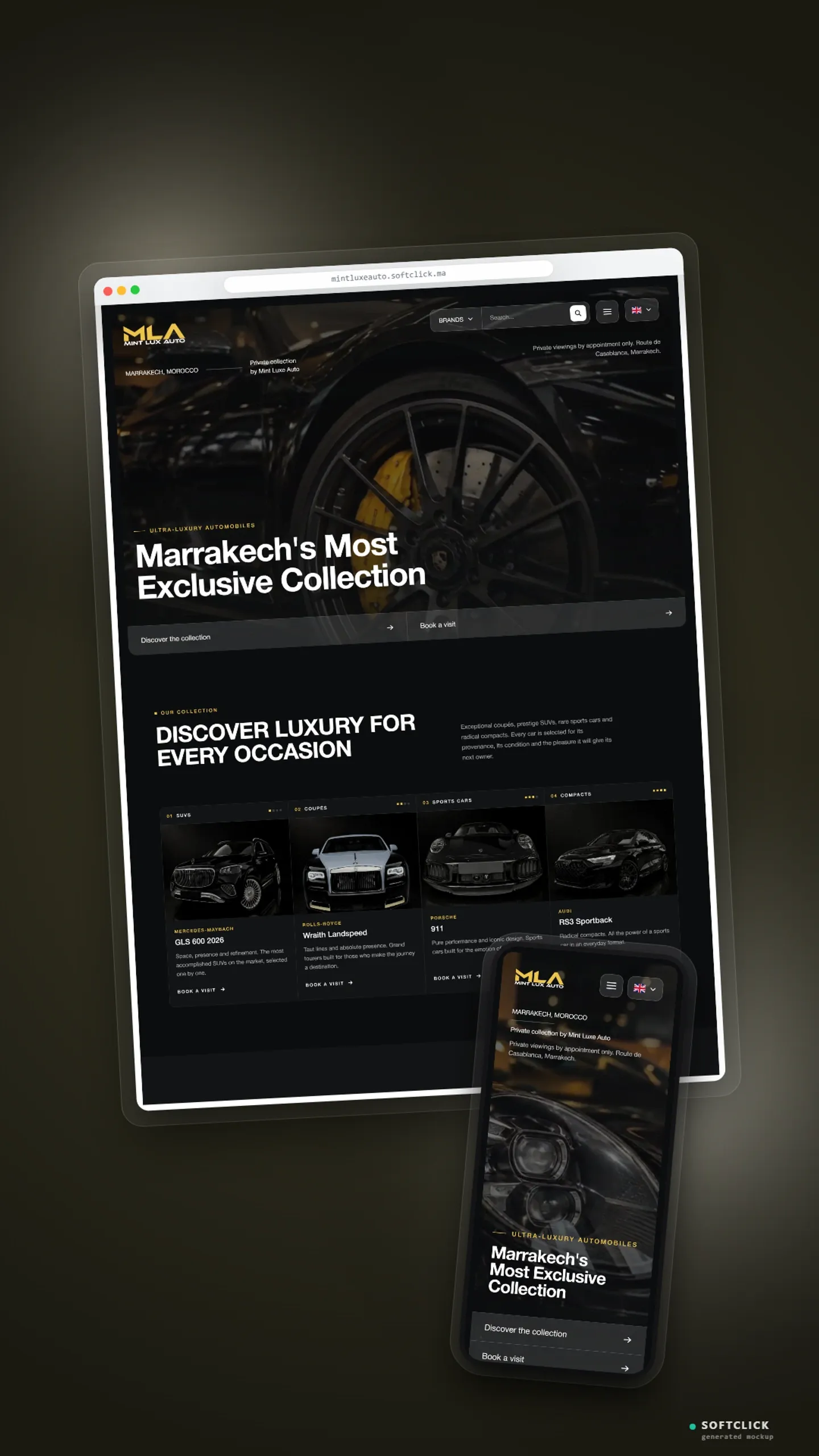
Designed section by section in Claude Design, then migrated pixel-perfect to a high-performance Next.js build, the site loads fast, animates smoothly on every device and drives visitors toward action: a product catalogue with hover-revealed cuts, CTA banners between every two sections, and a contact hub with Google Maps, phone and one-tap WhatsApp ordering. Choco Diamant now has a digital storefront as precious as its chocolate — "Du chocolat ? Non, du diamant !"
/ Gallery
Inside the build
Click to enlarge · ← → to navigate · Esc to close
4 images